
How to Evaluate Your Menu Design to Boost Profits
Menu engineering is essential to boosting your restaurant's profits. Learn how to take your menu engineering data plus the principles of menu design psychology to run tests on your menu.
Julia BeebeAuthor
Menu engineering is quite the hot topic these days in the restaurant space, and why wouldn’t it be? This world has been taken over by big data! There are so many tools out there to help you get access to all the info you need to make your restaurant successful.
But what do you do with this menu data once you find out where the biggest opportunities lie? You can start off with research into the psychology of menu design, but how can you take those lessons and apply them to your menu while still being conscious of your brand and restaurant design? Unless you’re a professional designer or have a good creative eye, you could do more harm than good.
Here are some tips on how to take your menu engineering data plus the principles of menu design psychology to run tests on your menu without totally ruining your design.
Now for the tips!
Restaurant Menu Templates
Use these menu templates as a starting point for your menu design or to give your menus a refresh.

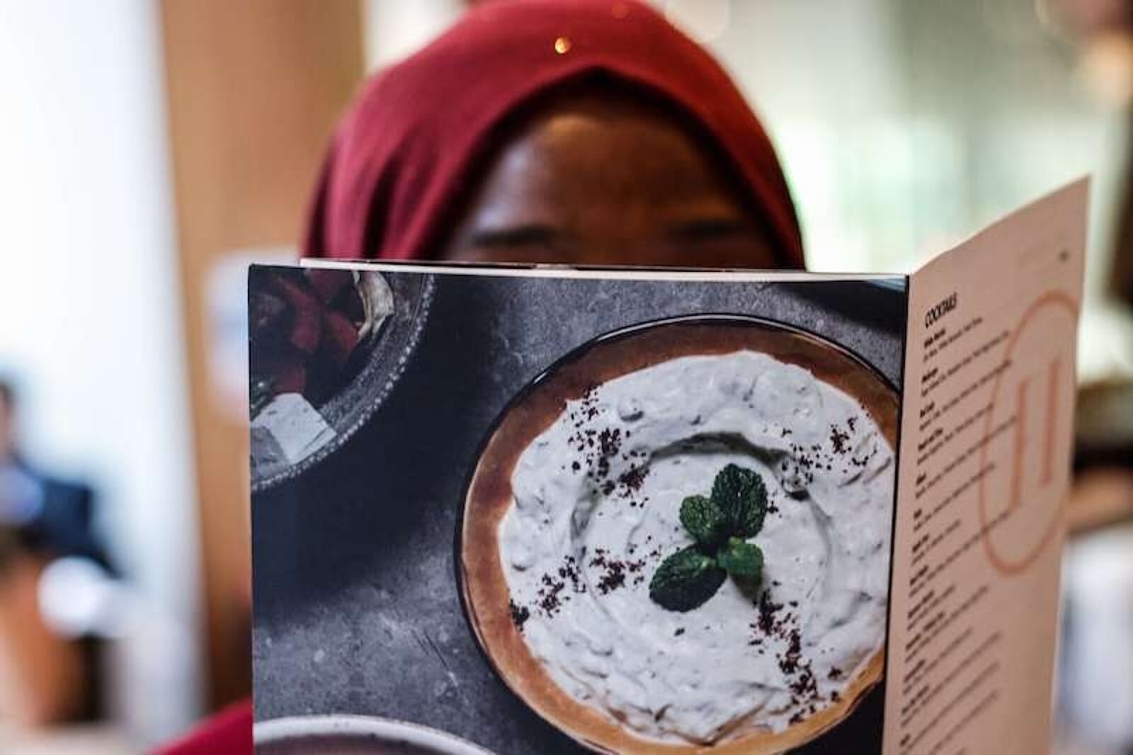
Highlight items by aligning color with logo:
If your restaurant has an established color palette, you can leverage that to organize and highlight items on your menu. Highlight your favorite items in your primary color in your logo, driving the guest's eyes immediately to those items around your menu.
Use a contrasting color to highlight menu items:
Create shapes or boxes around menu groups or specific items. This will help establish contrast around items that you want to be perceived as extra special.

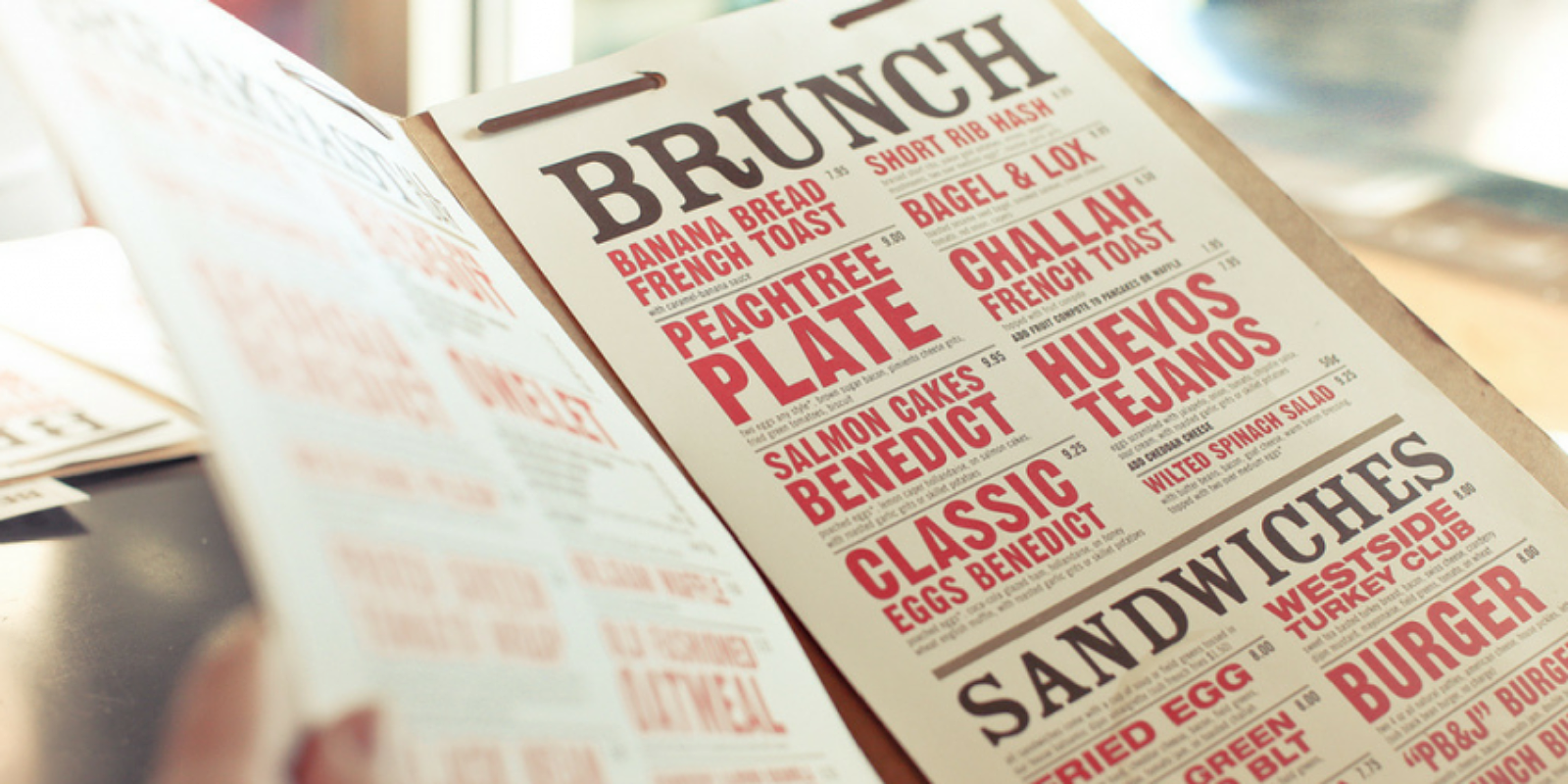
If color isn’t your thing, try the same idea with typography:
If you have a simple menu printed on craft paper or a refined look on a cream linen stock, maybe throwing some color on your menu isn’t a good fit for you at all. To use the same principle without distracting from your brand, try italicizing or bolding a particular menu item, writing in all caps, or introducing a new font all together.

If typography still seems scary, maybe just try this trick:
Just make a menu item’s name a bit longer so it goes on 2 lines and creates a little disruption to the eye. Anything that isn’t 100% symmetrical or the same will instinctively draw the eye.

Or even use iconography to draw attention or create additional groupings:
We’ve all seen icons to show which items are gluten free, include raw meat, or are vegetarian, but you can also use iconography to show items that have won awards, are your customers’ favorites, or are seasonal and limited. This is a fairly easy test to run on your menu fairly regularly without a lot of design help (just move that heart around to different items!
I know what you’re thinking: This is all well and good but 1) how am I going to afford to change my menu so often and 2) how will I even know if it is making a difference?
To answer your first question, more and more restaurants are switching gears towards a daily printed menu. You can buy a nice heavy stock paper and a reliable printer and simply have a folded menu, tuck it into a more traditional leather case, or get a quirky or trendy clip board. This allows you to play with your menu on a regular basis (whether the ingredients or the design), and it gives the feeling to the customer that this menu is just for tonight and next time it will likely be different.

For your second question, it’s fairly simple to track whether an item is getting ordered more often than before, especially if you do weekly inventory. But how do you know it’s not a fluke?
When I’m testing conversion rates on the Toast website, I always use a statistical significance calculator to see if the trends I’m seeing are significant. You can use the same theory but instead of website visits, you’re tracking customers and instead of conversions, you’re tracking how often a menu item was ordered. For best results, take one item’s data for about a month (assuming it has decent order volume), make the change on your menu, let the test run for the next month, then compare. You can get this data in product mix reports.
Using a statistical significance test will make you feel confident that the changes you’re making are worth your time and energy but don’t get discouraged if you don’t find statistical significance: just roll up your sleeves and prepare for your next test.
Calculating the profitability of an individual menu item is made easier when you have the proper analytics to draw from. Modern POS systems are designed to be central repository for all of that information so that it can all be easily accessed and analyzed.
Related Menu Ideas
Is this article helpful?
DISCLAIMER: This information is provided for general informational purposes only, and publication does not constitute an endorsement. Toast does not warrant the accuracy or completeness of any information, text, graphics, links, or other items contained within this content. Toast does not guarantee you will achieve any specific results if you follow any advice herein. It may be advisable for you to consult with a professional such as a lawyer, accountant, or business advisor for advice specific to your situation.
Subscribe to On the Line
Sign up to get industry intel, advice, tools, and honest takes from real people tackling their restaurants’ greatest challenges.